
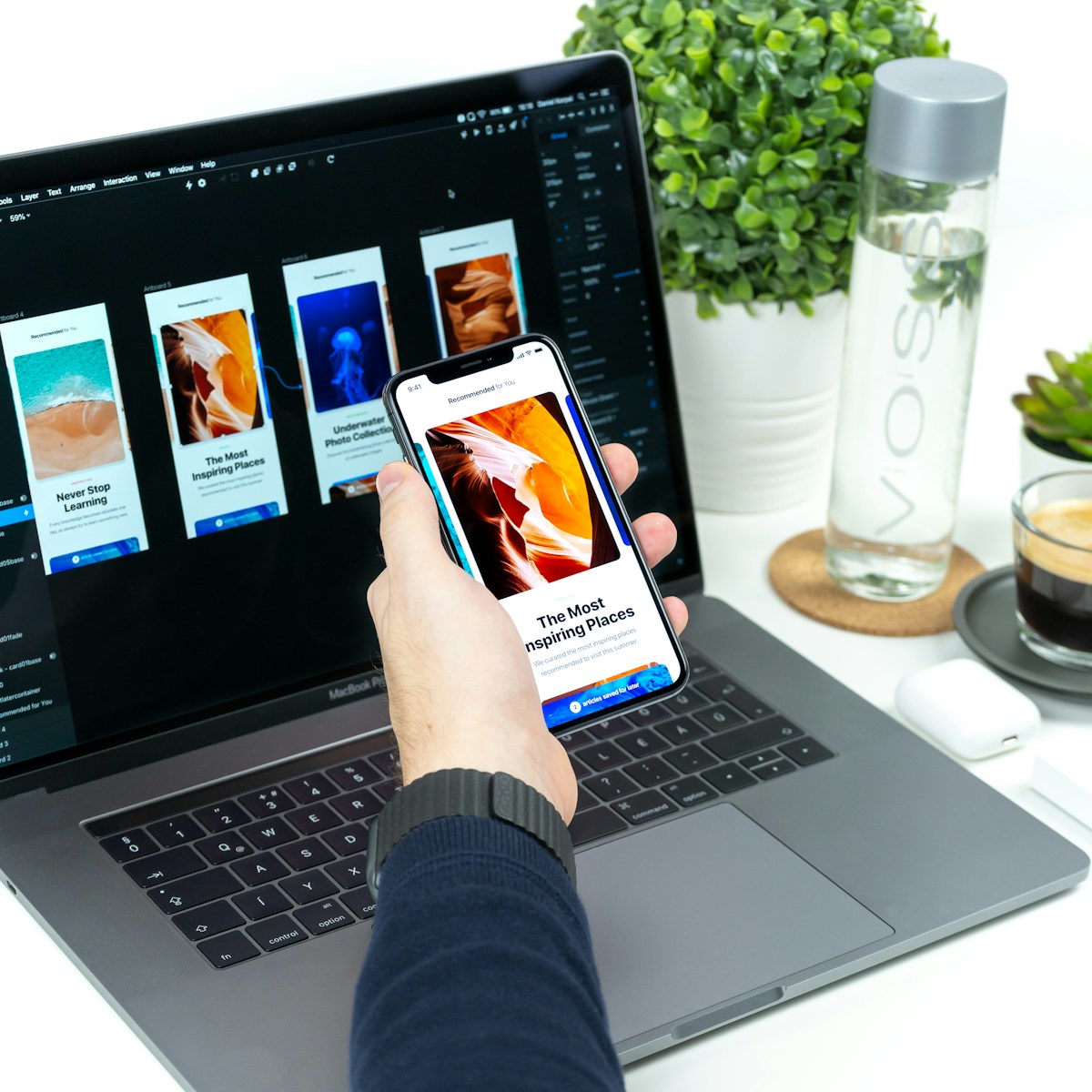
Beautiful design and high conversion are not in conflict — they are the same objective. The most converting websites in 2025 are the ones that make users feel confident, clear, and compelled to act.
Why Most Websites Fail to Convert
The average business website converts between 1% and 3% of visitors into leads or customers. The best-performing websites in competitive categories consistently achieve 8–15%. That gap — 5–12 percentage points — represents an enormous amount of uncaptured revenue for every business sitting in the average range.
The reasons for underperformance are rarely technical. They are strategic and experiential. Websites fail to convert because visitors cannot quickly understand what the business does, who it serves, and why they should choose it over alternatives. They fail because the visual design does not communicate credibility at the speed the brain processes first impressions — which research shows is approximately 50 milliseconds.
They fail because the path from visitor intent to conversion action is not obvious, not frictionless, and not compelling. And they fail because they are designed primarily around what the business wants to say rather than what the visitor needs to know to make a decision. Every conversion optimization decision should begin by asking: what does my target visitor need to feel, understand, and believe to take the next step?
The Hero Section: First 3 Seconds
The hero section — the above-the-fold area that every visitor sees the moment they land on your site — is the most valuable real estate on your website. Research consistently shows that 55% of visitors spend fewer than 15 seconds on a website. The hero section determines whether the remaining 85% stay and explore or bounce back to wherever they came from.
High-converting hero sections in 2025 share five characteristics: a headline that communicates the specific outcome you deliver for a specific audience (not a generic tagline), a supporting subheadline that provides context and resolves the most common objection, a single primary CTA that makes the next step completely obvious, a visual element (image, video, or illustration) that shows the outcome or experience rather than telling, and a trust signal (client logos, review score, or accreditation) that immediately establishes credibility.
The most common hero section mistake is leading with what the business does (services, features, capabilities) rather than what the client gets (outcomes, transformations, results). 'We build websites' is a capability statement. 'Get a website that converts visitors into clients — without the 6-month agency wait' is an outcome statement. The latter consistently outperforms the former in A/B tests across every category.
Value Proposition Hierarchy
A value proposition is not a tagline. It is the complete articulation of why a specific target customer should choose your business over all available alternatives — including doing nothing. Most websites communicate fragments of their value proposition scattered across multiple sections, requiring visitors to do cognitive work to assemble the full picture. High-converting websites present the value proposition as a structured hierarchy.
The hierarchy works as follows: Level 1 is the primary benefit — the single most compelling outcome you deliver. Level 2 is the proof — specific evidence that you deliver it (data, case studies, credentials). Level 3 is the differentiation — what makes you the best choice for delivering it compared to alternatives. Level 4 is the invitation — a clear next step that makes acting on the information easy.
This hierarchy should be traversable in under 90 seconds of scrolling. Users who reach the bottom of a well-structured value proposition hierarchy with all four levels satisfied are 5–7× more likely to convert than those who reach it with only the first level addressed.
Audit your current website by asking: can a visitor who has never heard of your business identify your primary benefit, a piece of specific proof, and why you are different — within 90 seconds of landing? If not, your value proposition hierarchy needs structural work.
Trust Signal Science
Trust is the fundamental prerequisite to conversion — and trust is built by specific, identifiable signals that the brain processes rapidly and largely unconsciously. Understanding which trust signals work in which contexts, and placing them strategically within the visitor journey, is one of the highest-leverage activities in conversion optimization.
Client logos are the most widely used trust signal and remain effective when executed correctly. The critical detail: logos should be from recognizable names in your target audience's context. A healthcare client in UAE will be reassured by recognizable local hospital or clinic logos. A B2B technology client in Istanbul will be reassured by logos of well-known Turkish enterprises. Generic or unknown client logos provide weak trust signals.
Social proof signals — review ratings, testimonial quotes, case study outcomes — are most effective when they are specific, attributed, and verifiable. 'Great service, would recommend' attributed to 'John D.' provides minimal trust lift. '340% organic traffic growth in 12 months' attributed to a named business with an industry and logo generates substantially more credibility and is significantly more likely to be compelling to prospects in similar situations.
Mobile-First Design Logic
Mobile traffic now accounts for 63% of all web sessions globally, and in MENA markets this figure consistently exceeds 70% across most categories. Designing for desktop and adapting for mobile — the traditional approach — produces systematically inferior mobile experiences. Mobile-first design reverses this: every layout, content decision, and interaction pattern is designed for mobile as the primary context, with desktop as the larger-screen adaptation.
Mobile-first design logic affects every element of a website. Navigation structures that work on desktop (mega menus, horizontal navigation bars, hover states) are fundamentally incompatible with touch interfaces and small screens. Content hierarchies that require scrolling through extensive text before reaching a CTA perform significantly worse on mobile than above-fold or early-scroll placements.
Form design on mobile deserves particular attention in MENA markets. Number pad-triggered phone number fields, single-column form layouts, large tap targets for interactive elements, and minimal required fields are not optional refinements — they are prerequisites for capturing mobile conversion volume in markets where phone is often the primary conversion channel.
Web Design Service
We design and build high-converting websites for ambitious businesses across MENA, Turkey, and international markets.
Typography & Readability
Typography is the single most underestimated driver of perceived quality and conversion performance on websites. The research is unambiguous: websites with higher typographic quality — appropriate font choices, consistent hierarchy, optimal line length, and sufficient white space — are perceived as more credible, more professional, and more trustworthy by visitors.
Line length is a commonly overlooked readability factor. The optimal line length for body text is 50–75 characters per line. Lines longer than 90 characters significantly increase cognitive load and reduce reading completion rates. On wide desktop screens, this means content columns must be constrained — full-width body text is almost always a readability error.
For MENA-market websites serving Arabic-reading audiences, Arabic typography requires separate treatment. Arabic fonts have different optical sizing, require more generous line-height than Latin equivalents, and demand right-to-left layout logic that affects not just text direction but the entire visual hierarchy of every page. Investing in a qualified Arabic typographer for bilingual website projects is a non-negotiable quality requirement.
White Space as a Conversion Tool
White space — the empty space between and around design elements — is not wasted space. It is one of the most powerful tools available for directing attention, communicating quality, and reducing cognitive load. The instinct to fill every available pixel with content is one of the most common and costly design mistakes we encounter in website audits.
Research shows that increasing white space around text increases comprehension by up to 20%. Premium brands across fashion, luxury, real estate, and professional services use generous white space as a primary signal of quality — it communicates confidence, clarity, and the absence of desperation that characterizes businesses competing on price rather than value.
Practically, the most impactful white space interventions in website conversion optimization are: increasing padding around primary CTAs (making them visually isolated and easier to notice), increasing line-height in body copy (improving readability and perceived quality), and reducing content density on landing pages (removing every piece of content that does not directly contribute to the conversion objective).
CTA Positioning and Psychology
Call-to-action design is the most directly measurable element of conversion optimization — and it is an area where small changes consistently deliver large, measurable results. The principles that govern high-performing CTAs in 2025 are well-established by behavioral research and refined by decades of A/B testing data.
CTA copy should communicate the specific next step and the value it delivers — not just the action. 'Get a Free Proposal' outperforms 'Submit' by 2–4× in most service business contexts. 'See How We Helped [Client Type]' outperforms 'Case Studies' as a navigation label. The micro-copy beneath a CTA button — 'No commitment required · Response within 24 hours' — addresses the hesitation that prevents clicking and consistently improves conversion rate.
CTA placement should follow the visitor journey, not the designer's preference. Above-the-fold CTAs capture decision-ready visitors who already know what they want. Mid-page CTAs following social proof sections capture visitors who needed evidence before acting. Bottom-of-page CTAs capture visitors who read everything before deciding. A page with only one CTA placement systematically misses conversion opportunities at every other stage of the decision journey.
Page Speed as a Revenue Driver
Page speed is not a technical metric — it is a revenue metric. Google's data shows that for every 1-second delay in mobile page load time, conversions decrease by 7% and bounce rates increase by 11%. For a website receiving 10,000 monthly visitors with a 2% baseline conversion rate, the difference between a 3-second and a 5-second load time equates to approximately 44 lost conversions per month — every month.
The most impactful speed improvements for most business websites are: image compression and next-gen format adoption (WebP instead of JPEG/PNG), eliminating render-blocking JavaScript, enabling browser caching, reducing third-party script load (tag managers, chat widgets, analytics), and implementing a content delivery network (CDN) to reduce server response time for geographically distributed audiences.
For MENA-market websites, CDN configuration is especially important. Content served from European or US-based servers to users in UAE or Saudi Arabia faces latency that measurably impacts page speed scores and user experience. CDN nodes in the Middle East region — available through major providers including Cloudflare, AWS, and Fastly — bring content delivery time within acceptable thresholds for GCC audiences.
Motion and Micro-Interactions
Motion design — scroll-triggered animations, hover states, loading transitions, and micro-interactions — has moved from a premium differentiator to a near-baseline expectation for professionally designed websites in 2025. Used correctly, motion guides attention, communicates interactivity, provides feedback, and elevates perceived quality. Used incorrectly, it creates distraction, increases cognitive load, and slows page performance.
The principle that governs effective motion design is purposefulness. Every animation should exist because it serves the user — by revealing content progressively, by confirming an action, by directing attention to a primary CTA, or by communicating a transition between states. Animations that exist purely for visual interest and serve no functional role are conversion liabilities, not assets.
For business websites in professional service categories (consulting, legal, healthcare, financial services), restraint in motion design is almost always the right choice. Subtle scroll-triggered fade-ins, clean hover state transitions on interactive elements, and smooth page transitions communicate competence and care without the visual noise that can undermine the trust signals the site is working to establish.
Related Insights
Hand-picked articles to deepen your expertise

The Future of SEO: 10 Strategies for 2025 and Beyond
Search in 2025 is no longer just about keywords and backlinks. It is a convergence of user experience, content authority, technical excellence, and AI-readiness. This guide breaks down what actually works.

Why Premium Branding Is Your Best Long-Term Investment
In markets saturated with options, the difference between a brand that commands premium pricing and one that competes on price alone comes down to the quality of its identity.